I am in the process of creating a top-line treatment to send out to potential collaborators and I realised that I had never considered the colour-grading of the film even though it is so important. I attempted to educate myself on this in order to choose the appropriate type of colour grading.
When telling a story, colours:
- Elicit psychological reactions
- Draw focus to significant details
- Set the tone of the movie
- Represent character traits
- Show changes or arcs in the story
- Being able to use colour to create harmony, or tension within a scene, or to bring attention to a key visual theme can be used to spectacular effect.
- Colour can affect us psychologically and physically, often without us being aware, and can be used as a strong device within a story.
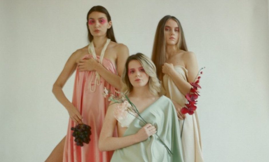
- A strong red colour has been shown to raise blood pressure, while a blue colour has a calming effect. Some colours are distinctly associated with a particular location or place, while others give a sense of time or period.
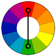
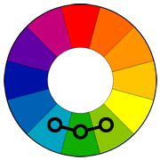
- In the RYB colour model, the primary colours are red, yellow and blue. The three secondary colours are green, orange and purple, and can be made by mixing two primary colours. A further six tertiary colours can be made by mixing the primary and secondary colours.
- Warm colours are bright and energetic. Cool colours give a soothing and calm impression.
5 Common Film Colour Schemes:
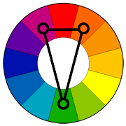
1. Complementary Color Scheme
Two colors on opposite sides of the color wheel make a complimentary pair. This is by far the most commonly used pairing. A common example is orange and blue, or teal. This pairs a warm color with a cool color and produces a high contrast and vibrant result. Saturation must be managed but a complimentary pair are often quite naturally pleasing to the eye.
Orange and blue colors can often be associated with conflict in action, internally or externally. Often a internal conflict within a character can be reflected in the color choice in his or her external environment.

The color palette of Jean-Pierre Jeunet’s “Amelie” is a great example of a complementary pairing of red and green.
Orange and Teal are readily apparent in this scene from “Fight Club.” Teal is often pushed into the shadows, and oranges into highlights.
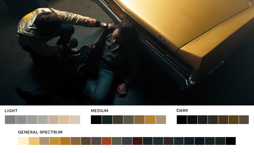
A similar look in this scene from “Drive.”
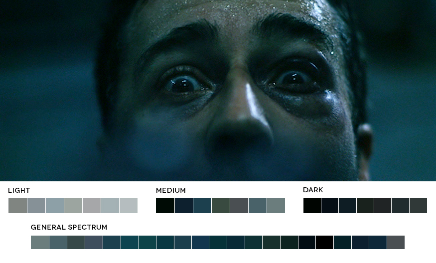
A complementary pairing isn’t always so obvious and the contrast between the two colors used is often relative. Another shot from “Fight Club” which at first appears just to have a strong overall teal tint to the entire image, but a closer look reveals there is still a orange touch to the skin tones relative to the deep blue green.
2. Analogous Color Scheme
Analogous colors sit next to each other on the color wheel. They match well and can create a overall harmony in color palette. It’s either warmer colors, or cooler colors so doesn’t have the contrast and tension of the complementary colors.
Analogous colors are easy to take advantage of in landscapes and exteriors as they are often found in nature. Often one color can be chosen to dominate, a second to support, and a third along with blacks, whites and grey tones to accent.
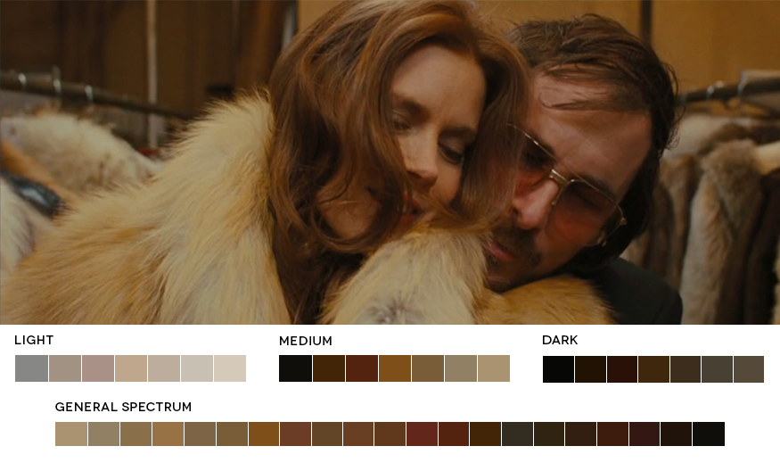
Reds, Oranges, Browns and Yellows in this scene from “American Hustle” fall next to each other on the color wheel forming a warm overall feel with very little tension in the image.
3. Triadic Color Scheme
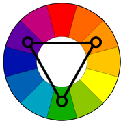
Triadic colors are three colors arranged evenly spaced around the color wheel. One should be dominant, the others for accent. They will give a vibrant feel even if the hues are quite unsaturated.
Triadic is one of the least common color schemes in film and although difficult, can be quite striking.
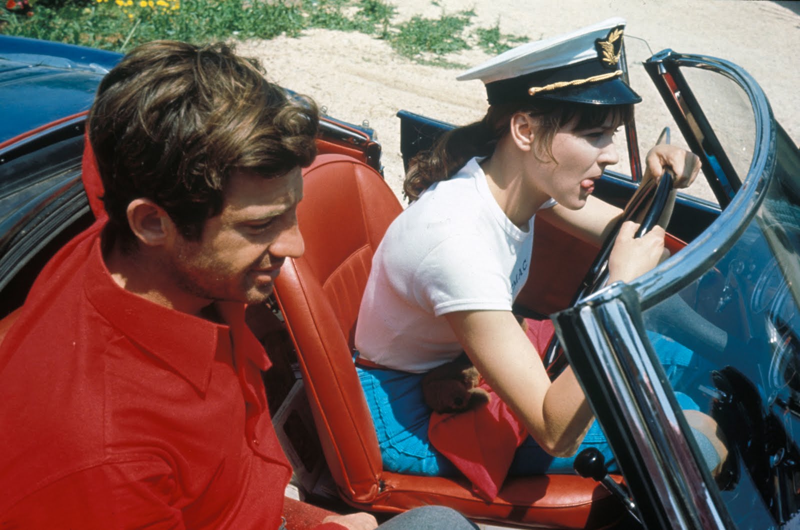
Jean-Luc Goddard’s 1964 “Pierrot Le Fou” makes use of a triadic color scheme of red, blue and green.
4. Split-Complementary Color Scheme
A split-complimentary color scheme is really very similar to complimentary colors but instead of using the direct opposite color of the base color, it uses the two colors next to the opposite. It has the same high contrast but less tension than a complimentary pair.
A split complimentary color scheme in this scene of the Coen Brother’s “Burn After Reading” of red, green and teal.
5. Tetradic Color Scheme
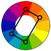
Tetradic colors consist of four colors arranged into two complementary pairs. The result is a full palette with many possible variations. As with most of these color harmonies, one color is usually dominant.
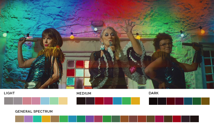
“Mama Mia’s” colorful party scene falls into the example of a tetradic choice of colors creating a well balanced and harmonious palette in a scene that could otherwise have looked like a bad disco.
Some common general looks that can be created in post pretty much regardless of what colours are in the image are the orange/teal look where orange is pushed into the highlights and upper-mids of the skin tones and teal (or blue green) is pushed into the shadows.

A scene from “Magnolia” showing another example of Hollywood’s love affair with orange and teal. Blue/green has been pushed into the shadows, and orange in the midtones and highlights specifically in skin tones.